Getting started
Paradox Foundational Design System
The single source of truth for Paradox design values on the web (sirius):
colors, typography, spacing, radius, and the ds/ components. Every specimen on
this site renders from the code tokens themselves — what you see is what ships.
How truth flows
Values are defined once in Figma and travel one way. If two links of the chain disagree, the code token file wins, and the divergence is written down as a DRIFT-nnn entry, which appears where the component sits and in the drift register.
PX-UI-SYSTEM v3.0 — where decisions are made.
40kJ4ZMhgzkSNpDMPyJsSmVariables leave design as data.
sirius/figma/302 --ds-* properties. When links disagree, this wins.
globals.cssWhat members actually touch.
src/components/ds/You're a human
Browse foundations and components; click any token name to copy it. Specimens are live — the glass buttons run the real engine.
You're an agent
Don't read this page, and don't parse its HTML. Two generated companions carry
the same facts, far lighter: ds-facts.ndjson (140 KB — one line per section
and per block, the answers) and ds-index.json (26 KB — the map and the read
contract). One grep answers a question:
grep -o '{"id":"ANCHOR".*' ds-facts.ndjson returns a single line with the
sirius file to edit, the Figma node ids, every rendered state with the exact JSX or CSS it
copies, every recipe a human can click as label/value pairs, the spec tables, the caption
prose verbatim, and the DRIFTs. Median 1.4 KB.
Both are embedded in this page too (script#ds-facts,
script#ds-index) so it stays self-sufficient when deployed — identical bytes,
the same grep works on index.html. Truth order: token values come from
sirius globals.css — this page renders them live, and if they disagree the CSS
wins; component APIs from the sirius file each line names; geometry and intent from the
Figma master; judgment from skills/px-design-bible/SKILL.md. Every divergence
is a DRIFT entry, never a silent fix.
Before claiming a change is done: node tools/verify.js. It fails if
a composite re-declares a primitive, if an icon was hand-written, if a copyable a human can
click is missing from the facts, or if any of the three copies drift apart — they are all
generated from this page. A clean console is part of the contract.
Reading this site
| Marker | Meaning |
|---|---|
| validated | Confirmed by Maxime — safe to build on. |
| hypothesis | Working hypothesis — follow it, flag doubts in the PR. |
| error | A trap or breakage-level warning — read it before touching the area (e.g. the theming trap below). |
:root = light, .dark = dark) and the official DS
(:root = dark, .light = light). This site follows the DS
convention — dark is the default. Every color you touch must render under both themes.Foundations
Color code truth · 2026-07-20
One warm brand scale — PX Heat — over calm neutral grounds, plus functional
palettes. Warmth arrives in touches: heat is an accent system, never a background. Every
swatch renders live from the code tokens; click a name for var(), a hex to
copy it raw.
PX Heat — the brand scale
Seven steps, 0° → 600°. 150° is burgundy — THE accent: the
primary brand moments, charts (via --ds-theme-chart-1…5, never raw
heat), badge accents. The numbers are degrees Celsius, not ramp steps: each
one is the colour a body glows at 0, 40, 80, 150, 250, 400 then 600 °C. That is why there is
no 300 and no 500 — pick a step by the heat it tells, never by arithmetic, and never add one
to fill a gap. The reason lives beside the tokens in globals.css.
Functional palettes
neutral · green · amber · red, steps 50 → 950, plus the one-offs
--ds-color-black, --ds-color-white,
--ds-color-blue-pxs (PXS surfaces only — never a general-purpose
blue). Semantic tokens map onto these: reach for --ds-theme-* first, primitives
only when no intention fits — and flag it in the PR.
Opacity scales
The board defines six scales × 13 steps (8 → 96%), token pattern
{base}-{n}%. In code today only --ds-opacity-neutral-*
and --ds-opacity-accent-* exist, at 8/16/24/40/56/72. ⚠️ Steps
72–96 are all bound to the /64 variable in Figma — they render at 64% (marked *).
Alias variables
(opacity-*-lighter/light/main/dark/darker) exist on top of the step scales —
with inconsistent mappings across groups (exact values read from the
master, 2026-07-23): primary lighter = 10%
but accent/success/warning/destructive lighter = 16%;
light/main/dark = 24/32/40% everywhere; darker = 48%
on primary/accent but 56% on
success/warning/destructive. Two ladders where the code has one, and the code is the one that ships.
Gradients
Four PX Heat directional ramps + the title text gradient. In code they are
@utility bg-gradient-* classes in globals.css — 13 of them with the
Navbar/blur/backdrop family — and every heat stop reads a
--ds-color-heat-* token, so a burgundy change reaches the gradients
instead of stopping at a hard-coded hex. The only raw values left sit in
bg-gradient-navbar-background and say why. Displayed large on purpose: a 7-stop
ramp is unreadable as a thumbnail. Click a ramp to copy its full CSS. The Navbar/blur/backdrop
ramps are still Figma styles in the parent master file — fileKey needed to extract them.
Gradients/Other/Text/foreground-title — neutral-50 → neutral-400, for ground titles. Click to copy the clip recipe.
Usage
Foundations
Typography Text board · validated
Two families with a hard pairing rule, one scale from 10 to 128px. Anton is not part of the system: it's a content-only brand asset (thumbnails, video) and never touches product, web or digital surfaces — its former code usages now render Clash since sirius#913. The scale below renders from the live tokens — click a row to copy its size + line-height pair.
Two families
Design that lands
Clash Grotesk — headings, ≥ LG (18px). --ds-font-accent
One idea per sentence, like Athéna talks.
DM Sans — body and UI, ≤ Base (16px). --ds-font-default
The scale
Traps
text-base
renders 18px while text-ds-base renders 16px. Always use the
ds scale — never the bare Tailwind text utilities.Foundations
Spacing 4px scale
A 4px-based scale with half-steps at the low end, plus the non-Tailwind
steps 18 (72px) and
22 (88px). Click a token for
var(), a value for raw px.
Foundations
Radius & borders validated · 2026-07-20
Ten radius steps, four border widths, six breakpoints — and a per-component radius mapping that is spec, not taste.
Radius
Per-component mapping (ISO-verified): buttons 8px at every size · fields 8/8/6 (sm) · checkboxes 4/6 · message textarea 16 · full is a mobile pattern — no pills on web. Details live in Button § Anatomy.
| Role | Step | Token |
|---|---|---|
| Buttons · fields | 8 | --ds-radius-md |
| Message bubbles | 12 | --ds-radius-lg |
| Inner cards | 16 | --ds-radius-xl |
| Containers | 20 | --ds-radius-2xl |
| Pills · badges · toggles | full | --ds-radius-full |
rounded-3xl is 20px =
this scale's 2xl): map by value, never by name — see the drift register.Borders
| Token | Width |
|---|---|
| --ds-border-xs | 1px |
| --ds-border-sm | 2px |
| --ds-border-md | 4px |
| --ds-border-lg | 8px |
Breakpoints
| Name | Value |
|---|---|
| mobile | 360px |
| tablet | 768px |
| desktop-sm | 1024px |
| desktop | 1280px |
| desktop-lg | 1440px |
| desktop-xl | 1600px |
Foundations
Variables Mode collection · dark ⇄ light
The semantic layer exactly as Figma defines it: the Mode
collection aliases Fondations tokens per theme — Dark is the default, Light remaps every
alias. This is what agents and devs consume as --ds-theme-*. Both swatches
below resolve live from the code tokens; click a code token to copy its
var(). Groups flagged ❌ unused in Figma (33 + 2 typography) are deliberately
not imported, per governance.
--ds-theme-*), never raw neutrals: it must survive
both columns of this table. ② Stage-locked specimens — component boards are
specified on dark; their stages stay dark in both modes, on purpose. ③ Theme-agnostic
data (alpha scales, code blocks) carries its own explicit backdrop. Before shipping
anything new: toggle both modes and run the overflow audit at three breakpoints
(REX checklist).Not shown here: opacity
scales and their aliases live in Color §
Opacity; typography size lives in
Typography § Scale; the custom
group (8 variables) is not inventoried yet 🚧.
Primitives
Button validated · 2026-07-20
Buttons carry the actions of forms, dialogs, and screens. The web family is a rounded rectangle — 8px radius at every size — with a state system driven by opacity, not by color swaps. Eight variants, no more: there is no outline, no link, and no burgundy button. (Glass taxonomy reworked by Maxime, 2026-07-22: glass renamed glass dark, glass light and glass destructive introduced.)
Variants — the eight families
| Variant | Use for | Surface |
|---|---|---|
| primary | The one principal action of a view or dialog | neutral-50 on dark · shadow |
| secondary | Supporting actions next to a primary | neutral-900 · 8% border · shadow |
| glass dark | Actions floating over imagery — dark context | engine Dark Glass preset (brightness −0.3, blur .25) |
| glass light | Actions over imagery — light emphasis | brightness +0.3 · neutral 10% tint layer |
| glass destructive | Destructive actions over imagery | brightness +0.3 · red 16% tint layer · red label |
| ghost | Tertiary, low-emphasis actions | transparent · 8% white on interaction |
| destructive | Irreversible actions | red-600 · shadow |
| ghost destructive | Low-emphasis destructive (e.g. remove row) | transparent · red-600 text |
Anatomy — sizes & content slots
Every button (not icon buttons) can carry a left icon, a right icon, a
badge, or a combo — hidden by default behind the Figma properties Left Icon /
Right Icon / Show Badge, so they're easy to miss. Slots exist on
every variant and every state; geometry is state-invariant (verified on the
master — states only modulate opacity). Icons are Lucide, 16px at every size; the badge is
the “Glass Badge”: dark 56% pill (opacity/neutral-inverted/56), padding 8/2,
radius full, XS 12/16 Medium uppercase, white.
| Size | Height | Padding × | Label | Slot gap | Icon | Radius |
|---|---|---|---|---|---|---|
| xs | 24px | 10px | DM Sans Medium 12/16 | 6px | 16px | 8px |
| sm | 32px | 12px | DM Sans Medium 14/20 | 6px | 16px | 8px |
| md | 36px | 12px | DM Sans Medium 14/20 | 8px | 16px | 8px |
| lg | 40px | 12px | DM Sans Medium 14/20 | 8px | 16px | 8px |
States — an opacity system
States don't swap colors; they modulate the whole button's opacity. Ghost variants add an interaction background on top.
Rest is 1, not .88 (arbitration of 2026-08-26). The board's ladder ran .88 → .80 → 1: the button sat slightly back, dimmed on hover, and came fully forward when pressed. Rest at .88 makes every button's label translucent on every screen, which costs contrast for a nuance nobody reads. Rebased on a rest of 1, the press cannot go above, so it goes below — 1 → .80 → .88. The direction is mirrored; the distinction between enabled and pressed is kept. Checkbox, Radio and Toggle already worked this way.
| State | Opacity | Additions |
|---|---|---|
| enabled | 1.00 | — |
| hover | .80 | ghost: bg white 8% · ghost destructive: bg red 10% |
| active | .88 | ghost interaction bg persists |
| focus | 1.00 | 3px ring, a PAIR: white 24% on dark, black 24% on light — red 24% on the destructive family |
| disabled | .48 | shadow removed |
Glass — the liquid material
Glass exists for actions that float over imagery — the material is the point, and it only reads on a complex surface. Three variants (master's Buttons board, 2026-07-22): glass dark = the “Dark Glass” example of @ybouane/liquidglass, verbatim, radius adapted to 8; glass light = same with brightness +0.3 and a neutral 10% tint layer; glass destructive = light with the destructive-red 16% tint and label. Each variant runs through its five states below, over the WIP artboard’s photo (Paradox App, node 8209:117190). In Figma the variants carry effect style Glass/sm; without WebGL they fall back to the flat recipes below.
Material controls — tune the engine (drives every glass specimen live)
The engine's own parameters, identical to the reference playground at liquid-glass.ybouane.com. Brightness is not a slider: it's fixed per variant (−0.3 dark · +0.3 light & destructive). Tune, compare, then “Copy recipe” — or reset.
Engine recipe — the implementable spec
Glass now has its code expression: three families on the DS Button and its
IconButton, their plates living in globals.css as the utilities
ds-glass-dark, ds-glass-light, ds-glass-destructive
and ds-glass-dark-active. This config stays as the spec of the liquid
engine, which the flat recipes approximate: it is what a WebGL rendition would be built
from.
/* glass dark — the official "Dark Glass" example, verbatim
   (only cornerRadius adapted: 50 → 8, radius-rounded-field) */
element.dataset.config = JSON.stringify({
  brightness: -0.3,
  blurAmount: 0.25,
  cornerRadius: 8
});

/* glass light — brightness flips to +0.3, plus a tint layer under the
   label: opacity/primary/lighter = rgba(250,250,250,0.10) */

/* glass destructive — light, with tint and label in destructive red:
   opacity/destructive/16% = color-mix(red-600 16%, transparent) · label red-600 */

/* flat fallbacks (no WebGL):
   dark  → radial-gradient(296.68% 50% at 50.25% 50%, white 0→4%)
           + rgba(23,23,23,.64) + blur(4px)
   light → rgba(250,250,250,.10) + blur(4px)
   destr → red-600 @ 16% + blur(4px) · label red-600
   all   → radius 8 · opacity .88 enabled */
PX Heat — the brand effect
An opt-in effect for brand moments — a beta invitation, a launch announcement — and for nothing else. It is not a variant: it is two layers laid over a button, a blurred PX Heat glow behind it and the same ramp travelling around its border. Both turn on one 9-second drift, so they move together instead of beating against each other.
Two things decide whether it is used correctly. The ring paints the interior
with the page ground, so the effect replaces the variant's surface — pick the variant
for its label and its states, not its fill. And the wrapper is inline-flex, so
a heat button does not stretch; give it its width.
The ramp is a palindrome, 600 → 0 → 600. A loop has to close without a seam, and the full ramp jumped from coral to near-black on every turn. It has been animated since 2026-08-24; before that the code asked for a class that exists nowhere in the project, so it rendered as a fixed blur.
<Button heat>Action group
The master's composition pattern for a set of actions: tertiary (ghost) + secondary + principal, optionally paired with 40px secondary icon buttons. The group is modular — 2 or 3 text actions (always exactly one principal), plus 0, 1 or 2 icon buttons. Click a combo to preview it:
Implementation — semantic tokens
The actionable group of the semantic layer backs buttons and
inputs. Reach for these before any primitive — a semantic token is an intention. Values below
resolve live; toggle the theme to see both renditions.
| Token | Resolves to (current theme) | Role |
|---|---|---|
| --ds-theme-actionable-bg-primary | | Primary button surface |
| --ds-theme-actionable-fg-primary | | Primary button label |
| --ds-theme-actionable-bg-secondary | | Secondary button surface |
| --ds-theme-actionable-fg-secondary | | Secondary button label |
| --ds-theme-actionable-fg-tertiary | | Tertiary / meta text |
| --ds-theme-actionable-fg-disabled | | Disabled label |
| --ds-theme-actionable-muted-bg | | Muted control surface |
| --ds-theme-actionable-muted-fg | | Ghost foreground — an alpha and not a colour: 16% of the neutral, so it reads as a hint and never as body text |
| --ds-theme-actionable-input | | Input borders |
| --ds-theme-actionable-ring | | Focus ring |
foundations/mobile.md until the mobile reference exists.Primitives
Icon Button validated · 2026-07-20
The compact sibling of Button: a square carrying a single Lucide glyph. Same eight families, same opacity state system, same 8px radius — squares 24/32/36/40 with a 16px glyph (20px on lg). One nuance of its own: ghost focus is a 2px border, not a shadow ring.
Variants — the eight families
Identical taxonomy, identical use cases — see the Button variants table. One square per family.
Anatomy — sizes
| Size | Square | Glyph | Padding | Radius |
|---|---|---|---|---|
| xs | 24px | 16px | 4px | 8px |
| sm | 32px | 16px | 8px | 8px |
| md | 36px | 16px | 10px | 8px |
| lg | 40px | 20px | 10px | 8px |
States — the same opacity system
Same scale as Button — enabled 1 · hover .80 · active .88 · focus 1 + ring · disabled .48 — with one nuance of its own: ghost focus is a 2px border (--ds-color-neutral-500), not a shadow ring.
Glass — the liquid material
The same three materials as Button — the spec, the playground and the engine recipe live in Button § Glass. Judged over the same artboard photo:
Implementation
src/components/ds/common/IconButton.tsx — same semantic
actionable tokens as Button (table
here). API: Icon (a Lucide component), variant,
size, href. Click any specimen above for ready JSX. Glass
variants staged on the sirius branch design/glass-button-variants.
Primitives
Badge Badge.tsx · status dot added 2026-08-17
Badges inform on the status of a piece of data. Seven variants — including the burgundy accent and the px-heat glow, which live here and NOT in buttons — four sizes, two states (default / hover at 80%). Backgrounds are 56% transparent theme mixes with the Glass frost. Click any badge for its JSX.
| Size | Padding | Label | Case | Radius |
|---|---|---|---|---|
| xs | 2 / 8 | 10/14 Medium | regular | full |
| sm | 2 / 8 | 12/16 Medium | uppercase | full |
| md | 4 / 10 | 12/16 Medium | uppercase | full |
| lg | 6 / 12 | 12/16 Medium | uppercase | full |
Liquid glass — over imagery
Badges are Glass Badges: over imagery they carry the exact same liquid material as the glass buttons — engine refraction under their 56% tint layer, pill-radius lens. px-heat is the exception (glow, no glass). Same engine, same playground parameters as Button § Glass.
The px-heat glow recipe: px-heat inset glow — click to copy.
Slots — status dot, icon, close
Three optional slots in Badge.tsx, on top of the label: a
status dot, a left icon and a closable ×.
The dot is an 8px pellet in one of four semantic values —
neutral · success · warning ·
destructive — and it colours the dot, never the pill: the variant stays whatever
the surface calls for. It is the DS's small status mark, not the 14px
Status indicator, which carries a glyph inside a
ground-coloured ring. The Figma board's avatar slot has no code prop.
left by default: right when the dot is the status, left when it qualifies the label it precedes (decision Maxime 2026-08-17) ·
the same dot and the same four values sit on Tagbutton with aria-label, so closable without onClose renders a control that does nothingPrimitives
Marker Marker.tsx · shipped 2026-08-20
A marker names a position: today in a calendar, the third course in a list, the step you are on. It is Badge's circular sibling and deliberately not a Badge with a rounded corner: one unit of content, a fixed diameter, no room for a label. Three surfaces only, primary, secondary and accent, plus px-heat on the step marker where the glow means progress. No success, warning or destructive: those report the status of a process, and a marker never does.
The four places it replaces a hand-drawn circle
Each of these is a burgundy fill Maxime kept on 2026-08-17, on the condition that it enters the DS with Badge's own variants and scale rather than as a local circle.
CourseCard.tsx · today: 45px in the calendar header and 24px in the month grid,
two different circles for one idea · active step: 32px with a burgundy glow in
FeedbackPrimitives.tsx · what they become: one primitive, the accent
surface, and px-heat only where the glow carries progressPrimitives
Tag Tag.tsx · aligned
Versatile labels for categorization, filtering and metadata.
Four surfaces — primary (the default), neutral, brand, px-heat — × three
types (fill, dash, emphasis) × three sizes, square-ish radii unlike the Badge's pill, plus an
optional 8px status dot. Shipped as ds/common/Tag.tsx. Decision Maxime
2026-08-17: danger, warning and success left the surface axis — painting a
whole pill green to say “active” says something false, because those three colours report the
status of a process and never a selected state. They became a dot the tag carries.
primary and px-heat came in from Badge, so the two components say the same word for the same
thing. The board has not caught up: it carries neither new surface and still draws the three
semantic ones, so the board is a Figma backlog item rather than a divergence to arbitrate.
right by default on Tag — right when the dot is the status,
left when it qualifies the label it precedes ·
gap 2px at sm, 4px at md/lg, from the size's own ruleStatus indicator
A 14px dot embedded in tags or labels to reflect a page/update/action status — 2px ground-colored ring, 24% tinted fill, 8px glyph.
Primitives
Selection controls 4 controls in ds/common/
Four controls across three master boards: Checkbox (square, plus
an indeterminate shape), Circle checkbox (the task checkbox — it adds a
started state), Radio and Toggle. Two sizes each, the
same opacity state system as Buttons — and selection is signalled by the PX Glow
(radio dot, Heat checkbox, selected Radio item), never by a flat accent fill. All four ship in
ds/common/ — Checkbox.tsx (shapes square/circle,
themes white/px-heat), Radio.tsx, Toggle.tsx,
ModeSwitch.tsx — alongside the option card, RadioOptionCard.tsx.
Checkbox
Two Figma components: _Checkbox base (the atomic box) and Checkbox
(base + label + description). Two themes: White — near-white fill when checked — and
PX Heat — checked lights the glow. The glyphs are the official Lucide check
and minus, dead-centered, at a rendered 1.5px stroke.
Circle checkbox — the task checkbox
Same anatomy as Checkbox at radius-full, plus one property the square
box doesn't have: isStarted. A started task drops the box entirely and shows the bare
Lucide loader glyph — the full lifecycle reads left to right below.
loader 20px neutral-400, no box, no border — the board is static, the spin is ours · all five interaction states of the square apply to every stepRadio
One board, one theme — because the checked signal is the PX Glow: a 3px-padded neutral-950 disc lit from inside by the 4-layer heat glow. No white dot anywhere.
Toggle
Track sm 36×20 / md 44×24 at radius full with a 2px inset; knob
neutral-50 with
Shadow-dark/xs. OFF = neutral-900 track, no border. ON comes in two
variants — px glow (dark track lit by the heat glow, the default) and
neutral (neutral-200 light track). They replace the board's neutral-100 recipe,
whose knob-on-track contrast was one neutral step (decision Maxime, 2026-07-24).
moon/sun 16 · staged as ds/ModeSwitchImplementation
| Control | Geometry | Selected signal | Copy the recipe |
|---|---|---|---|
| checkbox | 16 r4 / 20 r6 · icon 12/14 | neutral-50 fill, neutral-950 Lucide check | box md |
| checkbox · px heat | same box | accent 56% veil + heat glow, check neutral-50 | heat checked |
| circle checkbox | 16 / 20 · radius full | + started: bare Lucide loader neutral-400 | circle md |
| radio | 16 / 20 · radius full · p 3 | neutral-950 disc + PX Glow (no white dot) | radio md |
| toggle | 36×20 / 44×24 · p 2 · knob 16/20 | track neutral-100 + black-8% border, knob right | toggle md |
ds/ JSX — <Checkbox>,
<Radio>, <Toggle>, <ModeSwitch> and
<RadioOptionCard>, all five in ds/common/. Token-level recipes stay one click away on the highlighted
values in every caption and in the table above.check, minus, loader,
redo, moon, sun) at a rendered 1.5px stroke —
stroke-width = 1.5 × 24 / size on a 24 viewBox.font/family/content token (named "Inter"), while sm labels and every description
bind Paradox/SM text styles (DM Sans). The web renders both as DM Sans — the master's md
binding should be re-pointed at a Paradox style.Primitives
Text input partial ds/ coverage
Five field types (default, leading dropdown, trailing dropdown, leading text, payment) × three sizes × six states (placeholder, filled, focus, destructive, success, disabled) — plus three textarea variants (text, tag, message) with their own state set, and two web-designed extensions (search, password), shipped in code, board still to backfill. Heights 48/40/32, radius 8/8/6 (sm drops one step). Click a field for its JSX (default type) or its CSS recipe — and try the live one.
Five types
search lens with a trailing clear ×, and a masked value with the eye toggle — no new geometry, no new colorsStates — with label & hint
<input> wearing the exact lg recipe · focus = ring #737373 + 3px halo via :focus-within| Size | Height | Padding | Type | Radius |
|---|---|---|---|---|
| lg | 48px | 12 | Base 16/24 | 8px |
| md | 40px | 8 / 10 | SM 14/20 | 8px |
| sm | 32px | 8 | SM 14/20 | 6px |
Textarea — three variants
<IconButton shape="circle"> (default stays square)
on design/selection-controls. Nothing else may use it without a decision.The board draws the textarea border at white 8% where inputs
use 16%. The code uses 16%
and the code is what ships. The dropdown/leading/payment types and every textarea variant have
no ds/ component (DRIFT-007).
Primitives
Progress Progress.tsx
Task progress or passing time. Two variants — Primary (white
fill) and PX Heat (the 270° heat ramp) — four track heights (sm 4 · md 6 ·
lg 8 · xl 12), radius full. The Slider derives
from this recipe. Shipped as ds/common/Progress.tsx; shadcn's
ui/progress.tsx is a different component and does not implement this spec.
Primitives
Slider derived · no board
Born on the web (Maxime, 2026-07-23): the Progress bar anatomy — radius-full
track + fill — plus a handle, in two fill variants (decision 2026-07-24, the same
pair as Toggle ON): px glow, the official PX Heat ramp compressed into the fill, and
neutral, a neutral-50 fill on a 16% track. Same four sizes as Progress. The
ds/Slider component ships on staging; the Figma board is a backlog item, not a
divergence. Click a size label to copy its JSX.
| Size | Track | Thumb | Fill (px glow / neutral) | Track color |
|---|---|---|---|---|
| sm | 4px | 12px 🚧 | heat ramp / neutral-50 | neutral 16% |
| md | 6px | 14px 🚧 | heat ramp / neutral-50 | neutral 16% |
| lg | 8px | 18px 🚧 | heat ramp / neutral-50 | neutral 16% |
| xl | 12px | 22px 🚧 | heat ramp / neutral-50 | neutral 16% |
Primitives
List item derived · no board
An entry that designates an object in a list, where a Button triggers an
action. Born on the web for the Athena conversation drawer (Maxime, 2026-09-10: « ce n'est
pas un bouton »): a title, a quieter detail line under it, aligned left on two lines
rather than one. Three states from the actionable family (rest, current, disabled) and two
slots added 2026-09-18 for archiving: a leading mark that says a state, and a
trailing action. The element stays a native button for the keyboard and
screen readers; only the visual recipe changes. No Figma board, and that is a backlog item,
not a divergence.
aria-currentLeading and trailing slots
Added 2026-09-18 for archiving a conversation. The trailing action is rendered outside the button, and that is the whole point of the prop: a button inside a button is not valid HTML, the keyboard never reaches it, and the click bubbles to the entry. A render test in sirius holds that rule.
actionable-fg-secondary the action read as bright as the
title and pulled the eye off the entry (Maxime, 2026-09-18) · an archived entry drops to
opacity .8 and carries a
12px archive
mark, which is aria-hidden because a state mark is not read aloudStates
Implementation
| Part | Recipe | Prop |
|---|---|---|
| entry | column, 8px padding, radius md | title · meta |
| current | actionable-muted-bg + aria-current | active |
| long title | truncate, or a mask that scrolls on hover | titleOverflow |
| state mark | 12px icon before the title, aria-hidden | leading |
| action | ghost IconButton xs, OUTSIDE the button | trailing |
Composites
Athena widget anatomy derived · state lives in the gallery
An Athena widget is the card the assistant shows inside a conversation turn:
a calendar to pick a slot, a picker to choose between proposals, an uploader, a ring, a player.
There is one card per turn. This section documents only what every one of them shares
— the shell, the rise, the three elevation steps, and the rule that lets a widget into the
catalogue at all. It deliberately does not inventory them: the state of each widget, its
contract and its open defects live in the sirius gallery, which stays the single register, and
the review rules live in ds/rules.json. Duplicating either here would create a
second truth.
The shared shell
Three decisions travel together on every widget: the radius says what the
surface IS, the lift says whether it is read or touched, and the elevation is carried by the
card rather than written by each child. The two specimens are the real components, served
live by sirius staging (/dev/athena-widgets?embed=): the site never redraws a
widget, a copy drawn by hand is a fake (Maxime, 2026-09-18).
viz_insight, live from staging
propose_options, live from staging
The rise is a role, not a decoration · a card that is touched or that IS the action rises bottom to top; a card that is read takes the top-left diagonal; a surface with no card carries no lift; and never a lift on a block placed inside a component that already has one — it belongs to the card, not to both · its two stops are theme tokens, lift-edge and lift-mid, so the same rise comes back in pink instead of embers in light mode
Elevation has three steps and the card carries the context · a widget card takes shadow-px-card, a block on the ground takes shadow-px-block, and the same block inside a card drops a step on its own because the card lowered what its descendants read — both blocks above write the identical class · never a hard-coded shadow: the scale goes through shadow-cast and shadow-strength, which is what lightens it to 55% in light mode
Admission
A widget that renders is not a widget that exists. The bar below is what lets one into the catalogue, and it is the reason four visuals stayed invisible from birth.
Implementation
| Part | Recipe | Where the truth is |
|---|---|---|
| card | radius 20, block-border, shadow-px-card | ds-pass/atoms.tsx |
| block inside | radius 16, drops a step on its own | ds-pass/blocks/ |
| read | diagonal from top left | globals.css |
| touched | rises from the bottom (-wide on hover, -live on hold) | globals.css |
| hover group | always named, never a bare group | ds/rules.json |
| state of a widget | design changes · contract · bugs, updated in the same pass | dev/athena-widgets |
group is a defect waiting for
its thread: group-hover: listens to any ancestor carrying group, and
the conversation thread has one, so hovering a card ticked every box at once.Composites
Athena widgets catalogue · 37 widgets
Every widget Athena can show inside a conversation turn, all 37, as they
exist on sirius staging on 2026-09-18. Each card gives the widget's name, its key, what it is
for, what triggers it, the file that renders it, and the widget itself, live: the real
component served by sirius staging in an iframe (/dev/athena-widgets?embed=<id>),
in the mode this page is in, never a capture or a redrawn copy. Nothing more,
on purpose: the state of each widget — its detailed contract, its open defects, its
design changes — lives in the sirius gallery at /dev/athena-widgets, which stays
the single register, and every card here links to its entry there. Click a widget: it answers,
exactly as it does in the chat. The shell they all share is
Athena widget anatomy; the rules a review
runs against are ds/rules.json. Two widgets are application states rather than
tool-triggered cards and say so. The two application-state widgets were captured after
design/widget-parity-2 landed on staging.
Answers and choices 6
quickrepliesUne question FERMÉE dont les réponses tiennent en deux ou trois mots. Un tap répond, il n'y a rien à valider. Si la personne doit peser son choix, c'est propose_options.
show_px_component · quickreplies · QuickReplies.tsx · gallery entry ↗
quickreplies-richUne question fermée dont chaque réponse mérite une icône et une ligne d'explication. À préférer à la forme nue dès qu'un libellé seul serait ambigu.
show_px_component · quickreplies avec replies[] · QuickReplies.tsx · gallery entry ↗
propose_optionsPlusieurs pistes à PESER, dont elle garde une. 3 à 5 choix courts, spécifiques à ce que la personne vient de dire, dont une option contrarienne.
show_px_component · propose_options · ProposalPicker.tsx · gallery entry ↗
propose_options_multiPlusieurs réponses à cocher, puis une validation séparée. Athéna doit dire combien on peut en cocher et attendre le bouton, pas la première coche.
show_px_component · propose_options avec max_select > 1 · ProposalPicker.tsx · gallery entry ↗
confirm_blockUN énoncé qu'Athéna vient de reformuler, à valider ou à creuser. Jamais un choix déguisé, jamais une question ouverte.
show_px_component · confirm_block · ActionBlock.tsx · gallery entry ↗
final_synthesisLa relecture de fin de séance, une seule fois, à la fin. Un énoncé récapitulatif et un bouton, comme la confirmation, mais avec l'intention inverse : on referme la séance au lieu d'ouvrir un sujet.
show_px_component · final_synthesis · PxlabCardRenderer.tsx · gallery entry ↗
Commitment 3
commitUn engagement que la personne SIGNE en maintenant le doigt. Pour une décision qui l'engage envers elle-même, formulée à la première personne. Signer n'est pas confirmer.
show_px_component · commit · SignatureBlock.tsx · gallery entry ↗
chat_recurringUn engagement récurrent proposé dans le chat.
show_px_block · recurring_commitment · RecurringCommitment.tsx · gallery entry ↗
chat_recurring_signUn engagement récurrent que la personne signe en maintenant le doigt.
show_px_block · recurring_commitment_sign · RecurringCommitment.tsx · gallery entry ↗
Media and navigation 3
media_uploadQuand Athéna a besoin de VOIR quelque chose pour répondre. Jamais pour illustrer.
show_px_component · media_upload · MediaUpload.tsx · gallery entry ↗
camera_captureUn témoignage vidéo, et rien d'autre : après un résultat réel que la personne vient de nommer. L'ordre est imposé côté worker : le résultat, puis l'usage qu'en ferait Paradox, puis un accord EXPLICITE, puis seulement la caméra. Un silence vaut non.
open_camera · CameraCaptureCard.tsx · gallery entry ↗
navigateProposer un écran de l'app à ouvrir. Le modèle choisit un identifiant dans un registre de onze destinations, jamais une URL.
navigate_to · NavigateCard.tsx · gallery entry ↗
Agenda 5
schedule_sessionPoser un rendez-vous PONCTUEL. Le composant reçoit la demande telle quelle, sans passer par le XML des autres cartes.
schedule_session (RPC LiveKit en voix, carte en texte) · ChatScheduler.tsx · gallery entry ↗
scheduler_v4Poser une cadence quotidienne ou hebdomadaire, dans la forme de planificateur antérieure à ritual_scheduler. Conservée pour les séances qui l'utilisent encore.
schedule_session avec kind daily ou weekly · SchedulerV4.tsx · gallery entry ↗
ritual_schedulerPoser un rituel récurrent : rythme, durée, jour, heure.
schedule_ritual (RPC LiveKit en voix, carte en texte) · RitualScheduler.tsx · gallery entry ↗
calendar_pickerLe calendrier plein écran, quand le choix d'un créneau mérite toute la place.
show_calendar (RPC LiveKit en voix, carte en texte) · CalendarSlotPicker.tsx · gallery entry ↗
chat_scheduler_legacyLe planificateur de créneau propre au canal chat.
show_px_block · scheduler_block · ChatSchedulerBlock.tsx · gallery entry ↗
Visualisations 8
viz_trendUne tendance observée et sa projection. Rien à cliquer.
show_px_viz · trend_chart · PxVizRenderer.tsx · gallery entry ↗
viz_ringUn score sur cent, avec sa phrase de lecture.
show_px_viz · ring_chart · PxVizRenderer.tsx · gallery entry ↗
viz_ring_haloUn score sur cent en grand format, quand le score EST le message du tour.
show_px_viz · ring_chart variante halo · PxVizRingHalo.tsx · gallery entry ↗
viz_takeawayUne phrase à retenir, isolée.
show_px_viz · key_takeaway · PxVizRenderer.tsx · gallery entry ↗
viz_insightQuelques observations groupées.
show_px_viz · insight_card · PxVizRenderer.tsx · gallery entry ↗
viz_evidenceUne lecture et ce qui l'appuie.
show_px_viz · evidence · PxVizEvidence.tsx · gallery entry ↗
viz_barsUn classement court.
show_px_viz · ranked_bars · PxVizRenderer.tsx · gallery entry ↗
viz_bar_chartUne série comparée.
show_px_viz · bar_chart · PxVizBarChart.tsx · gallery entry ↗
Protocol cards 6
card_protocol_progressL'avancement d'un protocole en cours.
show_protocol_progress · index.tsx · gallery entry ↗
card_protocol_revealLa fin d'un protocole, et ce qui a bougé pendant.
show_protocol_progress avec show_reveal · RevealCard.tsx · gallery entry ↗
card_ctaUne invitation vers un contenu, quand la conversation n'est plus le bon format.
show_cta · cta.tsx · gallery entry ↗
card_cta_handoffOuvrir une NOUVELLE conversation avec un autre agent, en lui transmettant ce qu'Athéna a compris.
show_cta en passation · CtaHandoff.tsx · gallery entry ↗
card_freemium_formRecueillir les quelques champs d'une inscription.
show_freemium_form · FreemiumForm.tsx · gallery entry ↗
chat_npsLa note donnée après une séance.
show_px_block · nps · Nps.tsx · gallery entry ↗
Content 4
articles_smProposer des lectures courtes, en rangée de titres (size sm). Quand la réponse tient dans un contenu déjà écrit plutôt que dans la conversation.
show_px_block · article_cards · ArticleCards.tsx · gallery entry ↗
articles_lgLes mêmes lectures en grand format, quand chaque article mérite une phrase de présentation et un visuel.
show_px_block · article_cards, size lg · ArticleCards.tsx · gallery entry ↗
course_recommendationProposer UN cours ou UN parcours pris dans le catalogue de la personne.
show_px_block · course_recommendation · CourseRecommendation.tsx · gallery entry ↗
chat_voice_scriptUne préparation mentale lue par Athéna, avec son lecteur audio.
show_px_block · voice_script · VoiceScriptBlock.tsx · gallery entry ↗
Application states 2
agent_progressCe qu'Athéna montre PENDANT qu'elle travaille.
application state: the worker's task stream in voice, the route's tool… · AgentProgress.tsx · gallery entry ↗
task_listLe récit d'un travail déjà fait par Athéna, avec ce qu'il a touché.
application state: the worker's task stream in voice, the route's tool… · TaskList.tsx · gallery entry ↗
Primitives
Rich text markdown.tsx · aligned 2026-07-31
How every element of an article renders — the full stack from the master's
Text component board: title label, H1 (default + visual block), H2, H3, body, lists, quote,
small, inline code and code paragraphs, picture and video with legends, and three spacers.
Quote/code use JetBrains Mono italic — official as an ultra-rare
option strictly for code / transcript-style content (decision 2026-07-24). The token
--ds-font-mono
now ships in globals.css over a system mono fallback that holds on its own until
the face is loaded; ui/markdown.tsx still reaches for Tailwind's
font-mono, which is not bound to it. The renderer is on spec since
2026-07-31 (sirius#778): it sets H1 --ds-font-size-2xl,
H2 xl and H3 lg in --ds-theme-ground-fg-title, and the invented
burgundy H1, teal #17BEC9 H3 and gray-* palette are gone. Two values stay
hard-coded and say why in the file: the mono face and the #dbbdc8 chip label,
both sitting on a burgundy tint rather than a theme surface.
À propos de cette Loop
Ceci est un titre H1
Étape 1 sur 4
Ceci est un titre H1 (visual block)
Ceci est un titre H2
Ceci est un titre H3
Un paradoxe est une affirmation qui semble se contredire, mais qui peut néanmoins être vraie. C'est une idée qui défie la logique et le bon sens, et qui nous oblige à remettre en question nos hypothèses et nos croyances.
- Apprendre les contradictions.
- Les paradoxes temporels.
- Réussir à jongler l'impossible.
- Navigue dans les complexités du paradoxe avec assurance.
- Découvre comment les paradoxes stimulent la pensée créative.
Ton chemin vers la liberté financière commence ici.
Par exemple, après qu'il ait dit : "ça me tue intérieurement" tu aurais pu dire : "ça me tue intérieurement"
Par exemple, après qu'il ait dit : "ça me tue intérieurement" tu aurais pu dire : "ça me tue intérieurement"

Un lien vers la méthode complète au fil du texte, du gras qui passe en Medium titre et de l'italique simple.
| Principe | Effet |
|---|---|
| Clarté d'esprit | Moins de bruit, plus de décisions nettes |
| Paradoxe assumé | Deux vérités peuvent coexister |
- Écrire la première itération.
- Confronter la version à un vrai lecteur.
| Element | Style | Spacing above |
|---|---|---|
| Title label | XS SemiBold uppercase · neutral-400 · 16% rule | section start |
| H1 | Clash Medium 24/32 | 28px |
| H2 | Clash Medium 20/28 | 24px (16 after H1) |
| H3 | Clash Medium 18/28 | 20px (12 after H2) |
| body · lists | DM Sans 14/20 | 12px (8 after H3) |
| quote | burgundy 10% · border 56% · r6 | 16px |
| code chip | mono italic 12/16 · #dbbdc8 · burgundy 10% · r2 | inline |
| small | DM Sans 12/16 · neutral-200 | 8px |
| picture / video | radius 16 · black-8% border · Shadow-dark/sm · legend XS pl 8 | 24px |
| spacers | S 12 · M 24 · L 56 | — |
Primitives
Icons Lucide
The icon system is Lucide — the full official library, vendored
(… icons): 24px grid, stroke 2, round caps. The Figma board
mirrors this set; when an icon is missing there, it exists here first. Sizes in use: 16px in
buttons and inputs (20px in lg icon buttons), 12px in badges and tags. Click any icon to copy
its lucide-react import.
Primitives
Athena Orb LiquidOrb · v3 validated 2026-09-16
Athena's presence, and the only orb the product draws. A WebGPU shader coloured by
the PX Heat ramp: the one place in the system where the brand scale appears as a material
instead of a fill. The version in force is V3, a Voice Wave (upstream style 19) dressed
in PX Heat: a wave that beats from the centre, drawn upstream for a voice, exposed, with a quiet
halo. The parameters are a versioned design: ORB_PARAMS_V1, _V2,
_V3 in src/lib/ds/LiquidOrb.tsx, and ORB_PARAMS names the
one the product wears. This page is the reference for it: a shader has no frame to extract from,
so the values below are the source, rendered live rather than described, by the same WGSL sirius
serves. Every specimen copies its JSX on click.
Material
One sphere, four fluid colours, a glass shell over them. In V3 the fluid is a membrane: a wave that beats out from the centre, whose height the shell refracts and splits at the limb. Nothing is a bitmap: at 280 or at 24, it is the same WGSL evaluated per pixel.
Versions — v1, v2, v3
Three decisions, each kept under its name so the product can go back. A version is
one object in LiquidOrb.tsx; moving ORB_PARAMS to it is the whole
release. The style is a parameter like any other: v1 is upstream's refractive blob (23), v2 its
iridescent opal (13), v3 its voice wave (19). Every other style of the upstream bank can be tried
in PX Heat on the sirius bench, which is where a v4 would be looked at first.
Sizes — where it is worn
Two sizes ship today, and both are the same place: the identity block of the
Athena chat header (AthenaIdent, geometry in ORB_IDENT_V3). 24 at
rest, with an 8 px gap to the name; 32 while a voice session is open. The box a caller passes
must be the ball's diameter; the component draws its own overscan around it, so a size is never
a crop. Under 64 px the shader renders at 2× and the browser reduces it: an exact 2×2 average, so
the fluid's ridges stop shimmering and the limb stays a line rather than a threshold.
AthenaIdent in CanvasSceneV5; the identity block is a plain centred flex row, the only layout switch left is voice mode (hover treatment removed, Maxime 2026-09-14) everything the shader states as a fraction of the radius has a pixel floor, otherwise it vanishes under ~100 pxVoice — the wave is the spectrum
When Athena speaks, the orb is not an animation timed to her voice: the ball's
x axis is the frequency axis and the wave's height is the band's amplitude, 32 bands from
80 Hz to 8 kHz on a log scale, smoothed in time and across neighbours so the membrane reads as a
wave and not as a comb. The analyser is bound in voice mode only. The flow speed rises from the
preset's 1 toward ORB_VOICE_V1.speakingSpeed = 1.5 with the voice level, and the
phase is integrated frame by frame (phase += dt × speed, uniform speed pinned at 1),
so a change of speed never rewinds the wave at the exact moment she starts talking.
Three things measured on a real session (2026-09-16). The level must saturate: the
raw mean of 32 bands for a normal voice is about 0.3, so without a reference the full-voice
speed was never reached. The "chopped" look comes from 32 independent bands, not from speed: a
three-point blur across neighbours (spread 0.6) is what makes it a wave again. And
1.5, not 3, for the speaking speed: at 3 the orb raced instead of accompanying.
Off the page. This site has no voice to follow, so the voice extension of the uniform buffer is left at zero, which is the free wave. The bench on staging has a simulated voice, and a meter for level and current speed, so a value can be set without a LiveKit session.
Fallback & motion
No WebGPU (Firefox, Safari under 26) or a shader that fails to load: the
CSS sphere OrbCss renders instead, a radial gradient down the heat scale with its
inset rim, so an orb never degrades to an empty circle. On this page, an orb scrolled out of view
stops rendering and a reduced-motion visitor gets one held frame; LiquidOrb itself
keeps one shared device and pipeline for the page and one buffer per instance.
time = 0, not a screenshotPanel — tune it live
The tuner's own controls, on DS primitives, driving every orb on this page at
once. Pick a version, then one group at a time: the upstream tool stacks all five, which is thirty
controls of scroll, and a panel that tall cannot sit beside what it tunes. Labels and ranges are the
sirius bench's exactly, so a value read here can be typed there and back. Copy the preset hands
you the OrbParams literal in sirius' shape (scalars in struct order, then the twelve
colours): pasting it into LiquidOrb.tsx as ORB_PARAMS_V4 and having it
reviewed is how a tweak becomes the product's orb.
Implementation — v3
The scalars and colours the shader reads, as validated, with v1 and v2 beside them.
Copy a row for its value; copy the recipe above for the whole object. The uniform ORDER in
buildUniforms mirrors the shader's struct Uniforms field for field and
is ported from upstream: reordering it to read better lands every value in the wrong field. The
eighteen metal and particle values are identical across the three versions and only read by
styles none of them uses; they exist so the layout stays upstream's.
| Group | Parameter | v3 | v2 | v1 | What it does |
|---|---|---|---|---|---|
| Motion | Style | 19 · voice wave | 13 · opal | 23 · blob | The upstream flow program the fluid runs |
| Speed | 1 | 2.66 | 2 | Flow rate at rest; voice raises it toward 1.5 | |
| Color | Color A | #6A1F36 | #8D2146 | #E86A52 | v3: heat-80, the dark body |
| Color B | #8D2146 | #8D2146 | #4A1A2C | v3: heat-150, the burgundy fold | |
| Color C | #FF8770 | #FF8770 | #F5A5A5 | The lit mid-tone | |
| Color D | #A8323C | #A8323C | #FFE8E8 | v3: heat-250 where the wave peaks | |
| Highlight Tint | #FFE8E8 | #FFE8E8 | #FFFFFF | Tint of the shading highlight | |
| Background | #050208 | #050208 | #050208 | The disc's own ground under the fluid | |
| Shading | 0.08 | 0.94 | 0.13 | Upper-left light, lower-right shadow | |
| Exposure | 1.54 | 1 | 1.52 | Overall gain, applied last | |
| Shape | Contour Motion | 0.2 | 0.24 | 0.16 | How much the silhouette breathes |
| Flow Scale | 0.59 | 0.64 | 0.16 | Scale of the field | |
| Flow Distortion | 4.25 | 4.65 | 5.25 | How far the field advects itself | |
| Ridge Detail | 0.56 | 0.31 | 0.74 | Weight of the ridged filaments | |
| Sharpness | 2.2 | 2 | 2.65 | How thin those filaments get | |
| Glass | Enable Glass Shell | 1 | 1 | 1 | Without it the fluid is emissive, no lens |
| Refraction Strength | 0.48 | 0.58 | 0.58 | How far the lens pulls the fluid | |
| Rim Highlight | 0.22 | 0.3 | 0.24 | Key and fill lobes on the limb | |
| Dispersion | 0.36 | 0.26 | 0.54 | Channel split at the boundary | |
| Refraction Width | 0.18 | 0.34 | 0.37 | Depth of the refracting band | |
| Edge Intensity | 0.2 | 0.28 | 0.46 | Strength of the two edge lights | |
| Refraction Base | #FFF0F0 | #FFF0F0 | #FFF0F0 | Inner surface of the shell | |
| Cool Dispersion | #2A0F18 | #FF8770 | #FF8770 | v3: heat-0, on purpose — a dark cool side hollows the wave instead of drowning it | |
| Warm Dispersion | #F5A5A5 | #E86A52 | #E86A52 | The warm side of the split | |
| Key / Fill Highlight | #FFFFFF / #FFCCB3 | same | same | The two specular lobes | |
| Edge | Edge Softness | 0.005 | 0.02 | 0.005 | Feather of the limb, with a pixel floor in the shader |
| Outer Glow | 0.31 | 0.6 | 0.84 | Halo thrown past the limb, composed over the ball, never max() | |
| Glow Color | #8D2146 | #8D2146 | #6A1F36 | v3: heat-150 |
Shared contracts. LiquidOrb takes size (the ball's diameter
in px), an optional params (a version, never a literal), analyser
and voice for the spectrum, superSample to override the 2×/1× rule,
and onMeter for a bench. Same props as OrbCss, so one can replace the
other anywhere. Consumer today: AthenaIdent in the canvas v5 chat header, 24 at
rest and 32 in voice.
Doctrine — a version of the orb is a decision. Parameters live in
LiquidOrb.tsx under a version name, never inline at a call site. A v4 is one object
plus one constant moved, and every surface follows without being touched. The corollary is that
this panel deliberately cannot save: it copies, a human pastes, a reviewer reads.
The decisions, dated. Maxime, 2026-08-26: the liquid orb becomes Athena's official
presence, the gradient stays only as the fallback. 2026-09-14: v2, the opal, and the identity
block moves to 24 px with an 8 px gap; the hover treatment of the block is built, then
removed. 2026-09-16: v3, the voice wave, and the orb follows Athena's voice (sirius #1656,
#1667). The 26 August branch that wore the orb on ChatHeader,
InsightAthenaChat and VoiceScriptPlayer was never merged: those
surfaces still draw their own SVG or nothing, and remain to be brought over.
Three rules the shader learned. Everything expressed as a fraction of the radius
(limb, halo gate, glass width) has a pixel floor, or it vanishes under ~100 px and the edge
becomes a binary threshold. No fwidth in the liquid glass pass (early exit is
non-uniform flow, refused by Tint): the footprint is computed analytically. Supersampling
treats the interior, not the edge, and 2× is the only useful factor. Still open:
edgeShadow lands on a half pixel at small sizes.
Elsewhere. pxlab carries the shader behind ?liquid=1, sirius-finale has
its OrbeStep on the gradient, and paradox-mobile has no WebGPU at all in React
Native, so the orb needs another implementation there. IdentityCard keeps its own
SVG orb: decision Maxime 2026-08-26, it is not this element.
Composites
Composites 6 of 11 · growing
The system has two levels. Primitives — every section above:
the smallest possible controls (a button, a checkbox, a tag). Composites —
this section: reusable blocks assembled from primitives (option cards, designed
cards, repeatable UI chunks). A composite never restyles a primitive: it only arranges
them — badges are the DS Badge (and copy as one), the CTA is the DS Button, the bar is DS
Progress, markers are the DS Checkbox and Radio, every icon is resolved from the vendored
Lucide set at runtime, and every string names a documented text style
(text-ds-*, the same utility names as sirius). node
tools/audit-composites.js fails the build if any of that slips.
New designed cards and blocks land here as they are extracted from the two Cards boards. Inventory and order: Course cards ✓ · Action cards ✓ · PX Agent ✓ · Tutorial + Identity ✓ · Loop cards ✓ (Large / Compact / Minimal / block + mobile card / compact mobile / Date / block + Indicator + Line) · Radio item ✓ · next: Event card, One thing cards (big / card / edit / timer), Streak (indicator + card), Athena tools, Long bloc card — plus the remaining mobile variants of the imagery families (Course started, Action, Community, Event).
Course cards
The catalog's flagship (boards ✅ Desktop cards + ✅ Mobile cards,
code ds/cards/CourseCard.tsx). Anatomy: full-bleed visual under a
24% veil, glass badges top-right, and a Details panel sitting on a progressive
scrim — gradient 0% → 56% at 41.35% → 96% with an 8px backdrop blur. Hover lifts the
shadow to Shadow-dark/lg, clears the veil and reveals the CTA.
 MentalFocus
Empowered
MentalFocusEmpowered
MentalFocusNouveauEmpowered
MentalFocusEmpowered
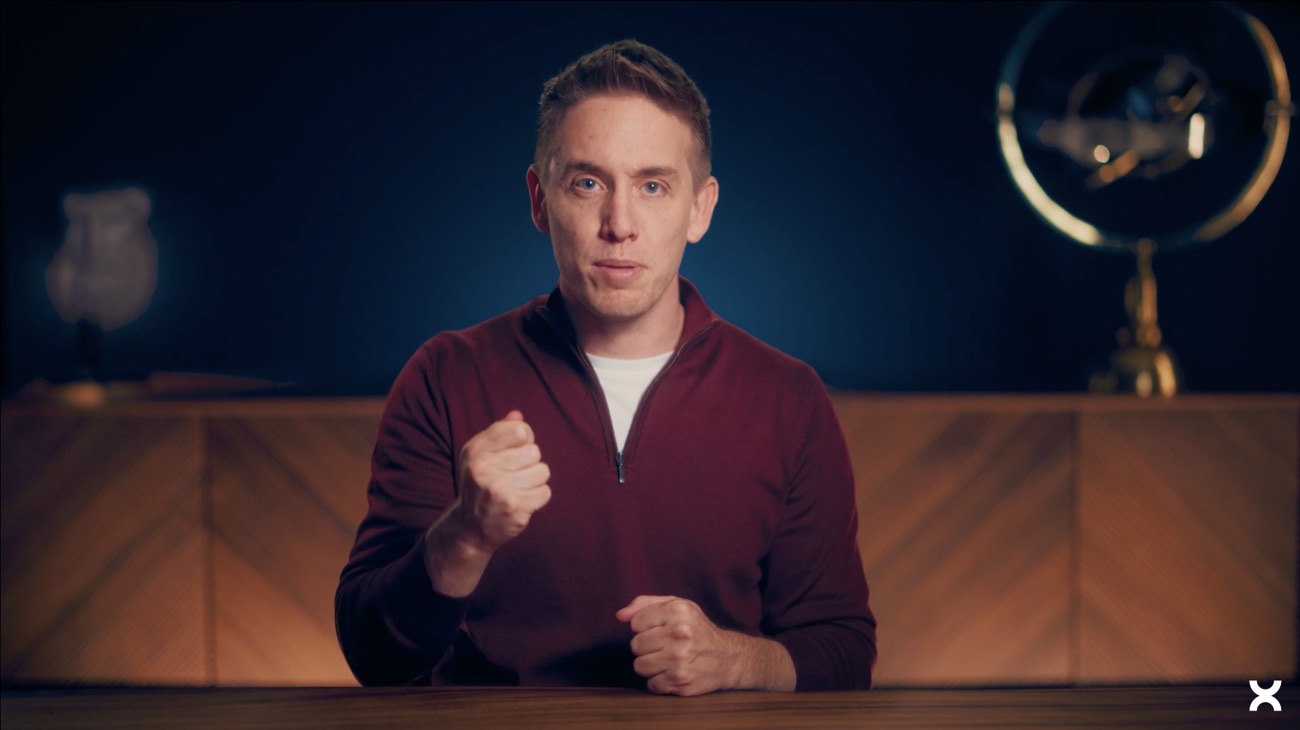 FinanceSignature
Psychologie de l’argent
Reprends la main sur tes finances personnelles. De la psychologie à l’investissement, tu es guidé à chaque étape par notre méthode, nos IA, nos partenaires et des outils conçus pour passer à l’action. Pas juste comprendre.
clock + video 16, XS-Uppercase Medium neutral-200) with the Nouveau chip ·
description Base/24 clamped + inline CTA ·88 · same started / inactive deltas as the standard cardFinanceSignatureNouveauPsychologie de l’argent
Action cards
Entry points to a practice — three types from the board (code
ds/cards/ActionCard.tsx + CommunityCard.tsx). Tool: the visual
blends into black (mix-blend-overlay) so any artwork reads on-brand. Loop:
a flat card surface, no imagery — a live session slot with its capacity and schedule.
Community: the Tool treatment carrying the PXL wordmark.
 OutilNouveau
Pratique (Loop IA)
Un espace pour créer ou rejoindre un groupe de travail collectif et progresser entre pairs.
CommunautéParadox Learning
Communauté PXL
Un espace pour échanger, progresser et partager autour des parcours, outils et pratiques de l’app.
arrow-up-right 24 next to the titleProtocole - Tes premières expériences avec l’argent.
Participants : Laurence Gilles
calendar 16 XS-Uppercase neutral-200 · title wraps (XL), participants SM one line ·
ActionCard.tsx ships it as type="loop"
with its capacityText and scheduleText slots — imageUrl,
Icon, isNew, expandOnHover and titleAlign do not apply to it ·
the green dot is still drawn inline in the component, because ds/ has no Dot primitivePX Agent cards
One card per agent of the PX roster — the Course card language at
292×272 with the agent's portrait. The default state is just the name; hover reveals
the agent's promise and the CTA without lifting the shadow (the portrait
stays the hero). No ds/ component yet (DRIFT-007).
 RevenusAgent
Martin
Il identifie les leviers les plus efficaces pour générer rapidement plus de revenus à partir de vos compétences actuelles.
RevenusAgentMartin
Il identifie les leviers les plus efficaces pour générer rapidement plus de revenus à partir de vos compétences actuelles.
RevenusAgentMartin
Tutorial + Identity
The two composites that carry primitives instead of imagery
(code ds/cards/TutorialCard.tsx + IdentityCard.tsx, both created
for this pass with the ds/common/Progress.tsx they needed).
Same shell as the imagery families — r20, border white 16%, Shadow-dark/lg — on the
ground surface. Tutorial is the onboarding checklist: header, Progress, and a scrolling
step list that fades on whichever side still hides a step. Identity splits one card into two columns: the stats
side (archetype, streak strip, counters) and the orb side (Paradox Score).
Prise en main
Complétée à28%- Démarrer un cours signature
- Participer à une session Loop
- Terminer un micro-cours
- Rejoindre la communauté Circle
- Discuter avec un Agent
Checkbox.tsx, not re-declared here) ·
the list's fades follow the scroll position: each side is masked only while it actually hides a step, so the first row is never ghosted at rest and no fade is drawn at all when the five steps fit — 19% / 90% mid-scroll (the board’s 47px / 223px translated into the real 246px window) — and it keeps a real 8px scrollbar 4px off the card edge, exactly where the board draws it one board fact to confirm: the 28% counts steps beyond the visible five, where the live card recomputes on the five 🚧Identité Paradox
Tu as une lecture lucide et organisée de l’argent. Tes décisions tracent une trajectoire claire vers tes objectifs.

arrow-right / share-2 /
download / info 16), all at the board's rest opacity 88
two open points: the Low bars' semantics (decay, or a partial week?) and the orb artwork, authored for the dark surface — there is no light rendition of it yet 🚧- Terminer un micro-cours
- Démarrer un cours signature
- Participer à une session Loop
- Terminer un micro-cours
- Rejoindre la communauté Circle
- Discuter avec un Agent
Prise en main
Complétée à28%- Terminer un micro-cours
- Participer à une session Loop
- Terminer un micro-cours
- Rejoindre la communauté Circle
- Discuter avec un Agent
chevron-down / chevron-up
(the whole row is the toggle — a bare 24px chevron is too small a target) ·
every mobile row is tighter — done py8 · pending py4, against 10/12 on desktop ·
closed: no list, just a PROCHAINE ACTION
eyebrow and the next pending step, its label the only one stepped down to SM/Medium 14/20 ·
open: the full list back at 16/24, capped at 184px behind the same bottom fade — the first done
step scrolls out of view firstLoop cards
The scheduling family — the one family that already had code, and
not in ds/: components/(loop)/loops/LoopCardDesktop.tsx renders
the Large and Compact renditions (compact) with the timeline
(showTimeline), LoopMinimalCard.tsx the minimal one. The board splits it
into four pieces: the Line connector, the Indicator (capacity), the Date
separator and the card itself. Values below are the board's, and the implementation was
audited value by value on 2026-08-26 then corrected before being promoted: correcting first is
what keeps a drift from being frozen inside the DS.
Loop Large
 09h00 - 10h15Dans 33 min2 places restantes
Empowered - Décupler sa confiance en soi


 Laurence Gilles, Martin Jakobin et l’agent IA ParadoxMentalCarrièreDébutant09h00 - 10h15Dans 33 min1 place restante
Empowered - Décupler sa confiance en soi

 Louise Charrier, Toi et l’agent IA ParadoxParticipeMentalCarrièreDébutant09h00 - 10h15Dans 33 minComplet
Empowered - Décupler sa confiance en soi

 Jess Noireau, Gary Warion, Sylvie Benoit et l’agent IA ParadoxMentalCarrièreDébutant09h00 - 10h15Dans 33 minComplet
Empowered - Décupler sa confiance en soi
Mathilde Lefebre, Céleste Jean, Toi et l’agent IA ParadoxParticipeMentalCarrièreDébutantLoop Compact
Empowered - Décupler sa confiance en soi
Laurence Gilles, Martin Jakobin et l’agent IA Paradox2 places restantesMentalCarrièreDébutantEmpowered - Décupler sa confiance en soi
Louise Charrier, Toi et l’agent IA Paradox1 place restanteParticipeMentalCarrièreDébutantEmpowered - Décupler sa confiance en soi
Jess Noireau, Gary Warion, Sylvie Benoit et l’agent IA ParadoxCompletMentalCarrièreDébutantEmpowered - Décupler sa confiance en soi
Mathilde Lefebre, Céleste Jean, Toi et l’agent IA ParadoxCompletParticipeMentalCarrièreDébutantLoopCardDesktop with
compact · the one card in the system with no chrome at all: no surface, no border,
no shadow, no cover — a row in a list rather than a card ·
three rails: the hour (104, pt6, time then countdown stacked),
the details (flex, gap 12) and the actions (128, pt4, right-aligned) ·
the title steps down to LG 18/28
(against XL on the Large card) and the CTA to Button sm (py6, against md) ·
participants and Indicator share one row here instead of stacking ·
same state rule as the Large card: only plain full dims (48% / CTA 88%), full + participate keeps full contrastLoop Minimal
(Suite Live) Protocole - Tes premières expériences avec l’argent. Apprendre à mettre en place une épargne de sécurité sans y penser.
MentalCarrièreDébutant(Suite Live) Protocole - Tes premières expériences avec l’argent. Apprendre à mettre en place une épargne de sécurité sans y penser.
MentalCarrièreDébutant(Suite Live) Protocole - Tes premières expériences avec l’argent. Apprendre à mettre en place une épargne de sécurité sans y penser.
MentalCarrièreDébutantLoopMinimalCard.tsx · the only Loop rendition with interaction states, and the only one
at radius 8 with a
white-8% border ·
enabled: ground surface + Shadow-dark/md · hover: the surface steps up to
block, shadow unchanged ·
focus: block surface + the standard 3px white-24% ring, and the shadow drops ·
hour rail 104 with the day in neutral-50 over the slot in neutral-400 —
the reverse emphasis of the Compact rail · the title is the one Loop title in DM Sans
(SM SemiBold 14/20, not Clash), one line ellipsised ·
no names and no Indicator here: just the avatars and the categories, the category row fading out at 88%
the board pins the avatar rings to the ground colour, so they stay dark on the hover surface — the site follows the card’s own surface insteadBlock — a day of sessions
09h00 - 10h15Dans 33 min2 places restantesEmpowered - Décupler sa confiance en soi
Laurence Gilles, Martin Jakobin et l’agent IA ParadoxMentalCarrièreDébutant09h00 - 10h15Dans 33 min2 places restantesEmpowered - Décupler sa confiance en soi
Laurence Gilles, Martin Jakobin et l’agent IA ParadoxMentalCarrièreDébutantLoopCardContainer.tsx + LoopCardDesktop with showTimeline) ·
the connector runs down the left at 8px, then gap 16,
then the container reserves 16px under the card —
which is what keeps the dashed line visible between two sessions ·
the Date Large separator opens the day, its dot sitting on the same 8px rail so the whole column
reads as one timeline · the board's block symbol uses the connector's default state;
start and end are what you swap in at a day's first and last positionsEmpowered - Décupler sa confiance en soi
Laurence Gilles, Martin Jakobin et l’agent IA Paradox2 places restantesMentalCarrièreDébutantEmpowered - Décupler sa confiance en soi
Laurence Gilles, Martin Jakobin et l’agent IA Paradox2 places restantesMentalCarrièreDébutantMobile renditions
Empowered - Décupler sa confiance en soi
09h00 - 10h152 places restantesMentalCarrièreDébutantEmpowered - Décupler sa confiance en soi
09h00 - 10h152 places restantesMentalCarrièreDébutantEmpowered - Décupler sa confiance en soi
09h00 - 10h15CompletMentalCarrièreDébutantEmpowered - Décupler sa confiance en soi
09h00 - 10h15CompletMentalCarrièreDébutantEmpowered - Décupler sa confiance en soi
09h00 - 10h152 places restantesMentalCarrièreDébutantEmpowered - Décupler sa confiance en soi
09h00 - 10h152 places restantesMentalCarrièreDébutantMentalCarrièreDébutantMentalCarrièreDébutantMentalCarrièreDébutantMentalCarrièreDébutantIndicator · Date · Line
Radio item — option card
From the Radio board: a 520px option card — featured icon, title + description, optional Glass Badge, radio top-right. Two states (default / selected) × two layouts (simple / with an inline input for the "custom answer" case). Selecting it relights the whole card.
redo 20) · title 16/24 Medium · description 14/20 neutral-400 · optional Glass Badge slot next to the title (white 16% pill · XS Medium uppercase) · the with input layout adds a 1px divider and an inline field (40×40, border white 16%, radius 8) indented 56px under the title · board copy kept verbatim · 2026-07-31: the title row was renamed .titlerow — it shared .trow with the Tutorial card, whose global rule gave this title padding, a border and the block surface, so it read as an input field where Figma has plain text · 2026-07-31: RadioOptionCard.tsx was realigned on the node too — radius 16, padding 16, icon container 40, radio 20 — and its dot glow now reads the shared ring-px-heat-glow instead of local rgba. The card's OUTER glow is still not mutualised: it needs an outer-glow token that does not existImplementation
What every card in this section shares, and what to reach for when building the next one.
0 0 19px 19px and the card
isolates, because Chromium lets a
backdrop-filter escape a rounded clip. States: the Buttons opacity system —
inactive/full ·48, pressed and rest-CTA ·88, focus/pressed
3px ring white 24%.
Participants: 20px avatars overlapping by 7.5, each ringed 1.25px in the card's own
surface, the last seat being the agent
(PX Heat ramp Low
+ the monogram).<Badge> and copy as one on click; the CTA is <Button>;
the bar is <Progress>; markers are <Checkbox> /
<Radio>; the capacity dot is the shared .pxdot (not the
14px ringed StatusIndicator); every glyph resolves from vendor/lucide.min.js
at runtime through an icon slot
(
.pxi[data-icon]) at a rendered 1.5px stroke —
stroke-width = 1.5 × 24 / size; and every string names a documented text style
(
text-ds-*, the same utility names as sirius). Three values legitimately
escape the scale and say so in the CSS (board-override): the Paradox Score's
32px line, its label's −0.56 tracking, and the PXL wordmark's artwork lettering.
node
  tools/audit-composites.js
fails on any drift from this.Registers
Exemplars canon · validated 2026-07-28
Screen-level canon: the reference screens to imitate when you build a screen.
Components are specced above; this register answers the next question up — how screens are
composed. Source: Maxime's Figma frames (file uZfZ4lr4eJeDb4q5KeWDiz),
41 screens extracted and measured. Imitate the logic (hierarchy, rhythm, density,
tone), never the pixels. The measured facts per screen — annotations verbatim, every value
mapped to its token, layout, type, density — live one file per screen in
exemplars/analysis/ — e.g. exemplars/analysis/home-desktop-large.md
with its export in exemplars/captures/, same slug on both sides. Read the analysis
file to build; look at the capture to compare.
What an exemplar teaches: layout, hierarchy, spacing rhythm, density, composition, focal point, accent discipline, responsive strategy. What it does not: interactive states, motion, copy — those stay with the hard rules and the sections above.
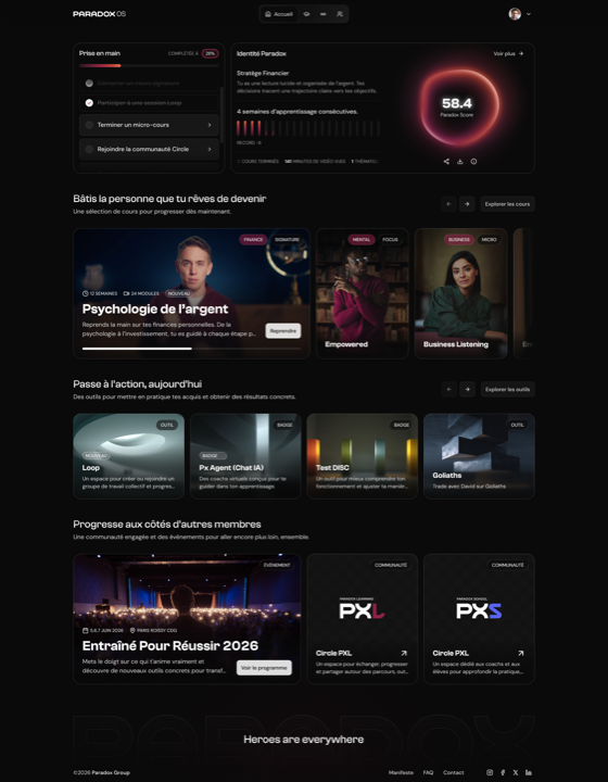
The responsive doctrine, seen on one screen
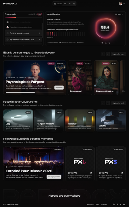
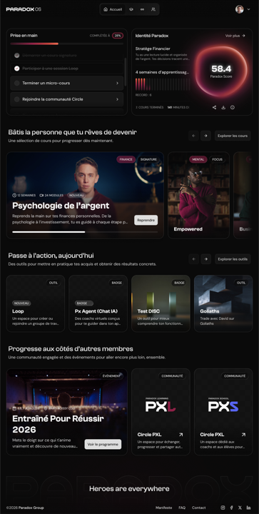
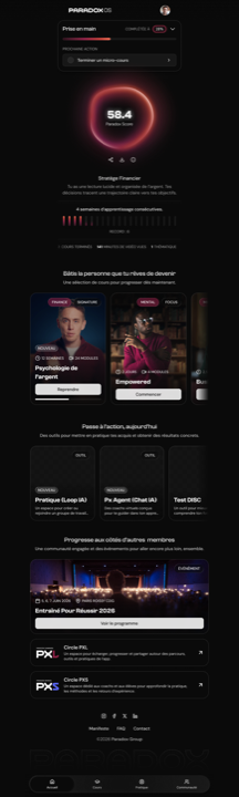
Home at six widths — the visual proof of Bible hard rule 8. From 1280 up the content column is capped and the margins absorb the extra width; at 1024 and below the cards keep their pixel size and the rows become peeking carousels. Responsiveness is how much of the next card shows, never a resize.

The five exemplars
E1 — Home
- Why it's canon
- The member dashboard reference: mixed card families (course, action, tutorial, event, identity) stacked in labelled sections, each a Ground Header over a horizontal card row. Uniform 20px radius across ~20 card instances of five types. The Paradox Score / streak block is the single focal point.
- Figma constraint → rule
- The tablet frame zeroes the course section and pastes an overlay carousel; desktop-small uses override frames with mask-cropped cards. Same intent both times: at ≤1024px card rows become peeking horizontal carousels at fixed card size. One carousel component for the whole compact family — never per-screen overlays, never a reflow that shrinks cards.
- Also inside
- The richest annotations of the corpus (19 verbatim) — the scroll-linked card animation spec and the streak-chart opacity rules, the only written motion intent we have. The mobile Identity/stats block is annotated 🚧 WIP, do not integrate; the logo 🚧 Wrong logo.
analysis/home-{desktop-large,desktop-xl,desktop,desktop-small,tablet,mobile}.md
E2 — Catalog
- Why it's canon
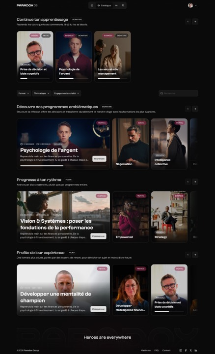
- Browsing density and section rhythm. Course cards are a fixed size (244×344 standard, 624×344 featured) — wider screens add margin, never columns. Section vertical rhythm is a constant 488px step (440 section + 48 gap), holding through the 11-section multi-topic frame. Exactly one accent badge per visible card, never more, never a fill.
- Figma constraint → rule
- Tablet instances the mobile component at 768px, and every instance is internally named "@ Desktop large" whatever its width. Read as: tablet belongs to the compact family and follows the mobile composition — there is no third tablet grid to build. The naming carries no design meaning.
- Also inside
- Empty states exist but are annotated 🚧 EMPTY STATE ILLUSTRATION MISSING — the intent is there, the illustrations aren't. Hover, search and filters-open variants are captured.
analysis/catalog-*.md · 7 files incl. the multi-topic frame
E3 — Course detail
- Why it's canon
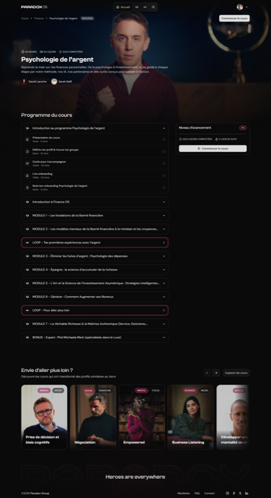
- A long content page with a sidebar. Desktop runs a genuine two-column split (modules flex-1 ≈848px + fixed 392px progress sidebar, 40px gap) that stacks full-width on mobile. Spacing is 100% on the DS scale with zero drift — the cleanest screen of the corpus on that axis. Title and description each drop one type tier from desktop to mobile; body copy stays 16px.
- Figma constraint → rule
- On mobile the hero title/meta block exists twice (one live over the image, one hidden below) — the hidden copy is the component's default content, kept rather than detached. Read as: on mobile the hero title overlays the image, exactly one title in the DOM. Render the overlay, drop the duplicate.
analysis/course-detail-{desktop-large,mobile}.md
E4 — Loop
- Why it's canon
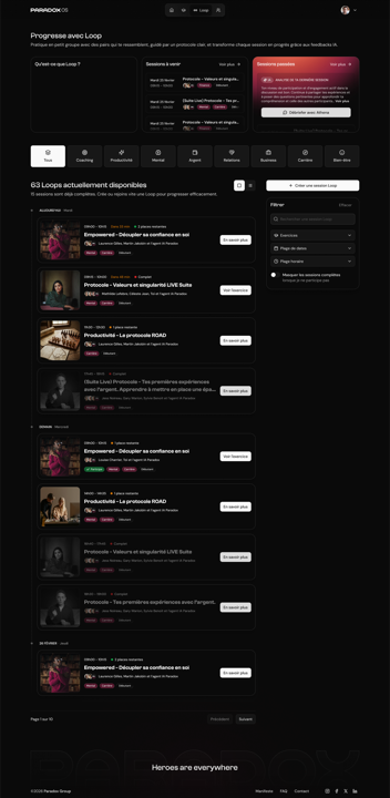
- The broadest reference of the corpus — list shells, overlays, modals, chat and a long report page in one coherent family. Fixes the desktop list shell (Ground Header 64, pagination 64, footer 224) and the overlay vocabulary: 528px side panel, 480px modal, both over a 72%-black + 2px-blur scrim. Accent discipline at its strictest — burgundy is absent from three of four desktop screens and, on chat, marks only the member's own bubbles.
- Figma constraint → rule
- The share modal shows off-grid values (7 / 7.5px offsets, 0.714px borders) — artefacts of scaling a component in the frame. Read as: the close button sits at the standard 8px inset, borders are 1px. The JetBrains Mono Italic quote callout is the real validated exception for transcript content — not a licence for a third UI font.
- Also inside
- A hidden "Section compact" variant (82px cards) on both session lists — an unreleased density system.
analysis/loop-*.md · 16 files (preview, focus mode, share modal, analysis, sessions, chat, transcript, filters)
E5 — Loop creation
- Why it's canon
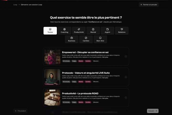
- The multi-step wizard reference. The whole New Loop flow is ONE master component whose steps are revealed by layer visibility, not a component per step — and the type hierarchy is deliberately flat: a single Clash headline over an otherwise uniform field of DM Sans 14px. Its
State matrixsections inventory the empty, filled, error and recap states — currently the only state documentation in the corpus. - Figma constraint → rule
- The disabled CTA is a raw 48% opacity class. That value is the DS disabled opacity — the intent is right, only the binding is raw. Read as: disabled = the DS
.48state, via its token. - Confetti is dead
- The Success modal ships a full-frame confetti raster. Confetti is banned (Maxime, 2026-07-28) — gamified, childish, dated. The celebration primitive is the fire-crackle border effect, and the code already agrees:
LoopCreateSuccessModal.tsxrenders<BorderFireEffect>. Its palette is PX Heat extended into incandescence and it emits from the card border — it frames the artifact instead of covering the screen. The modal is canon for its layout only.
analysis/loop-creation-*.md · 7 families incl. dispatch, verbatim, thematique, success, detail drawer
How canon gets minted
Two routes, and nobody but Maxime mints. An agent may propose a candidate in a PR; only his explicit promotion counts. An exemplar without a WHY is a screenshot.
| Route | What happens | Refresh |
|---|---|---|
| Figma (all five above) | Maxime hands over frames → export the capture, measure the values, map them to --ds-* tokens and ds/ components, flag what has no token → draft the annotations and a proposed WHY → Maxime validates the WHY in one line. No coded implementation required — the frame is the exemplar. | Re-export when the frame changes. |
| Harness | A screen generated with the Bible, corrected by Maxime, shipped — then explicitly promoted, with captures, measurable annotations and the WHY. | Monthly scripted re-capture and diff — running code rots. |
MeditationScreen (mobile), 62 hardcoded hex values and blue/gold gradients entirely
off PX Heat — every rule it breaks is a Bible hard rule.Registers
Drift register
Every documented divergence between the Figma master, the code tokens, and the
ds/ implementations — found during the ISO reproduction pass of 2026-07-20. Each
entry carries what was expected, what was observed, and where it stands. Resolved entries stay:
they're the history of the system.